What this covers
- Black and white applies a hard threshold; pencil often falls below it
- Greyscale keeps every tone and costs about four times the space
- Colour only where the colour carries meaning
- Check the faintest page, not the first one
Every scanning tool offers some version of this choice, usually without explaining what it does. The difference is not a quality slider; the two settings work in fundamentally different ways and fail in different ways.
What each one does
Greyscale stores a brightness value for every pixel - typically 256 levels from black to white. A pencil stroke that is 60 per cent grey is recorded as 60 per cent grey, and so is the slightly lighter one next to it.
Pure black and white stores one bit per pixel. Every pixel is either black or white, decided by comparing it against a threshold. Anything darker becomes black; anything lighter becomes white. There is no in between, by construction.
This is why pencil disappears
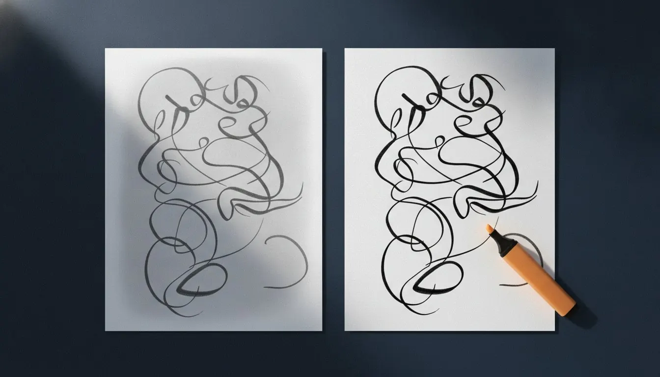
A firm ink stroke is well below any reasonable threshold and becomes solid black. A light pencil stroke may sit above it, and every pixel of it becomes white. Not faint - gone. The page comes back with the working missing and the heavier lines intact, which is a disconcerting thing to discover after submitting.
The same twelve pages, four ways
Measured on a handwritten set, photographed identically.
| Setting | Total size | Per page | Keeps |
|---|---|---|---|
| Colour, unprocessed | 34.8 MB | 2.9 MB | Everything, unusably large |
| Colour, contrast corrected | 5.1 MB | 425 KB | Colour, highlighter, all tone |
| Greyscale | 2.2 MB | 183 KB | All tone, including light pencil |
| Black and white | 0.5 MB | 42 KB | Firm ink only |
When black and white is right
Firm ballpoint or gel pen on white paper, where every stroke is well below the threshold. Printed text, where the contrast is enormous. Anything where the file has to be as small as it can possibly be and the writing is unambiguous.
The saving is genuinely large - about four times over greyscale - because a one-bit image of text compresses extraordinarily well. On a long document that is the difference between clearing a portal's size limit comfortably and fighting it.
When greyscale is right
Pencil, always. Faint ink. Anything with shading, a sketch, a graph drawn by hand, or a diagram where line weight carries meaning.
Also: anything you are not sure about. Greyscale is the safe default because its failure mode is a slightly larger file, and black and white's failure mode is missing work.
Choosing between them
The question is what you wrote with.
Greyscale
- Pencil, of any hardness
- Faint or inconsistent ink
- Shaded diagrams and hand-drawn graphs
- Anything you have not checked
- About 180 KB per page
Black and white
- Firm ballpoint or gel pen
- Printed text being rescanned
- When the size limit is genuinely tight
- Only after checking the faintest page
- About 40 KB per page
Colour, and when it is not optional
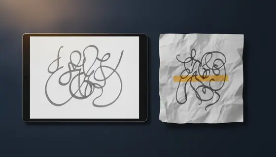
Colour roughly doubles the size over greyscale even after correction, and for most handwritten work it adds nothing. The exceptions are real, though: a diagram where colour distinguishes lines, a marked script where the marker's red is the content, a highlighted source extract.
If the colour carries meaning, keep it, and accept the file size. If it does not, greyscale produces a document that is easier to read on a screen as well as smaller, because the yellow cast of indoor light goes with it.
Deciding, in thirty seconds
- Look at what you wrote with
Pencil means greyscale. Firm pen means black and white is worth trying.
- Find your faintest page
Not the first one. The page where you were writing quickly, or the one with the most working crossed out.
- Process just that page first
One page, at the setting you are considering.
- Read it at full size
If anything has dropped out, go to greyscale. If it is all there, the rest of the document will be fine.
The clean-up settings
Why not just compress a colour scan instead
Because compression and clean-up do different things. Compressing a colour photograph of a page reduces its quality while keeping it a colour photograph of a page - with the yellow cast, the uneven background and the grey paper all still there, just slightly degraded.
Greyscale conversion with contrast correction removes the things that were not information in the first place. It gets you a smaller file and a more readable one, which compression alone never does.
Before committing a whole document
- Identify what the writing was made with
- Find the faintest page in the set
- Process that page alone at your chosen setting
- Read it at full size, looking specifically for missing working
- Default to greyscale whenever uncertain
- Keep the original photographs until the result is accepted
Questions and answers
My pencil work disappeared. What happened?
The black-and-white setting applied a hard threshold and the pencil sat above it, so every pixel of it became white. Use greyscale, which preserves the full range of tone.
Why is black and white so much smaller?
It stores one bit per pixel instead of twenty-four, and a one-bit image of text compresses extraordinarily well because it is mostly long runs of white.
Should I scan in colour to be safe?
Only if the colour carries meaning. Otherwise colour is roughly double the size of greyscale, harder to read on screen because of the lighting cast, and gains you nothing.
Can I convert a black-and-white scan back to greyscale?
No. The tonal information was discarded at the threshold and cannot be reconstructed. Keep the original photographs until you are certain.